library(tidyverse)
load('data/prevend.RData')
load('data/mammals.RData')
hand.fit <- readRDS('fns/handfit.rds')
sim.by.cor <- readRDS('fns/simbycor.rds')Week 10 activity: line fitting
This activity is a self-paced warmup in preparation for learning about linear regression. Simply put, linear regression consists of fitting a line to data in order to describe the relationship between two numeric variables.
By ‘fitting’ we do mean something a bit more specific than drawing any old line through a scatterplot, but it’s worth emphasizing that the criteria we’ll develop later in class, though formal, do reflect several common intuitions about what a ‘well-fitting’ line looks like. So, the goal of this activity is to explore some of those intuitions.
The over-arching question I’d like you to consider as you work through this activity is: what makes a line “good” as a representation of the relationship between two variables?
We’ll use two datasets:
prevend, which contains measurements of cognitive assessment score and age for 208 adultsmammals, which contains measurements of brain weight (g) and body weight (kg) for 62 mammal species
Scatterplots
To start, let’s review scatterplots. These are straightforward to construct using plot(...); in addition to what you have seen before, the commands below show you an alternate syntax for making scatterplots using a formula specification of the form y ~ x, as well as how to adjust the labels.
# variables of interest
age <- prevend$age
rfft <- prevend$rfft

# scatterplot of RFFT score against age
plot(age, rfft)
# alternate syntax: formula
plot(rfft ~ age)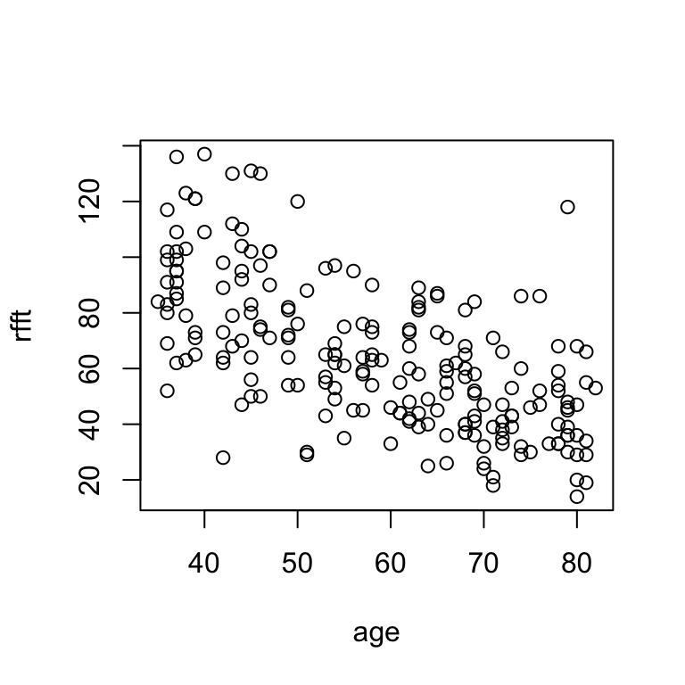
# change labels
plot(rfft ~ age, xlab = 'age', ylab = 'RFFT score')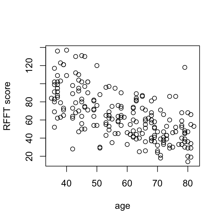
There is a negative linear relationship between RFFT score and age, suggesting cognitive function decreases with age.
Scatterplots allow for visual assessment of trend. A trend is linear if it seems to follow a straight line; linear trends are positive if they increase from left to right and negative if they decrease from left to right. Most of the time, you won’t see a perfectly clear straight-line relationship, so what we really mean by this is that (a) there’s a trend and (b) a line would describe it about as well as any other path drawn through the scatter.
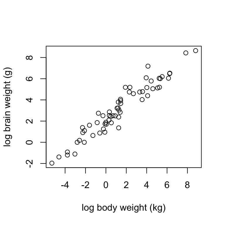
Using the mammals dataset, construct a scatterplot of log.brain (y) against log.body (x) using the formula syntax. Label the axes “log body weight (kg)” and “log brain weight (g)”. Describe the trend you see in the data.
In most contexts one variable is of direct interest, and the other is considered as potentially explaining the variable of interest. For example:
- in the
prevenddata, age might explain cognitive functioning - in the
mammalsdata, body size might explain brain size
Plots are typically oriented so that the variable of interest, or response, is on the vertical (y) axis and the explanatory variable is on the horizontal (x) axis. Throughout the rest of this activity, you’ll see these terms and the notation \(x, y\) used correspondingly.
Correlation
Both of the above examples show linear trends of differing strength. The prevend data are not as close to falling on a straight line as the mammals data, so there is a stronger linear relationship between log brain and log body weights than there is between RFFT score and age.
Further, the two examples show trends of differing direction: the trend in the prevend data is negative (RFFT declines with age) whereas the trend in the mammals data is positive (brain size increases with body size).
The direction and strength of a linear relationship can be measured directly by the correlation coefficient, defined as:
\[ r = \frac{\sum_{i = 1}^n(x_i - \bar{x})(y_i - \bar{y})}{s_x s_y} \] The correlation coefficient is always between -1 and 1:
- \(r \rightarrow 0\) indicates no relationship
- \(r \rightarrow 1\) indicates a perfect linear relationship
- \(r > 0\) indicates a positive linear relationship
- \(r < 0\) indicates a negative linear relationship
Correlations are simple to compute in R:
# correlation between age and rfft
cor(age, rfft)
[1] -0.635854Interpretations should note the direction and strength. Strength is a little subjective, but as a rule of thumb:
- \(|r| < 0.3\): no relationship
- \(0.3 \leq |r| < 0.6\): weak to moderate relationship
- \(0.6 \leq |r| < 1\): moderate to strong relationship
In this case:
There is a moderate negative linear relationship between age and RFFT.
Compute the correlation between log brain weight and log body weight; interpret the correlation in context.
# correlation between log brain and log bodyGenerally, the stronger the correlation, the easier it will be to visualize a line passing through the data.
The sim.by.cor function simulates observations of two numeric variables that have a specified correlation r. It returns a plot of the simulated data showing the scatter, the \(y = x\) line, and the sample correlation. The sample correlation will differ a little bit from the true value, so don’t be surprised if the sample correlation doesn’t exactly match the value of r that you input.
Use this to explore the correspondence between the sample correlation and the visual appearance of scatterplots:
- try several negative correlations
- try several positive correlations
- try both large (near \(\pm\) 1) and small (near 0) values
For each value of r you try, run the command a few times to see several simulated datasets.
# adjust r to see what different correlations look like in simulated data
sim.by.cor(r = 0, n = 500)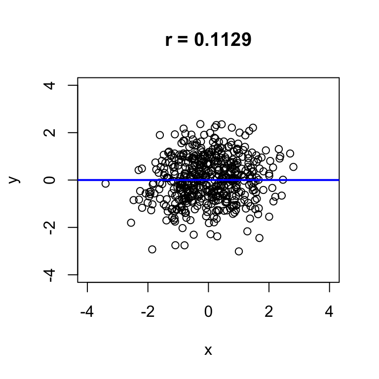
Hand-fitting lines
Now we’ll turn to actually drawing lines through data scatter to approximate linear relationships. We’ll do this by specifying a slope and (sometimes) intercept, so a quick reminder of the slope-intercept form for the equation of a line may be handy:
\[ y = a + bx \]
- the intercept \(a\) is the value at which the line passes through the vertical axis (the value of \(y\) when \(x = 0\))
- the slope \(b\) is the amount by which \(y\) increases for each increment in \(x\) (sometimes called ‘rise over run’)
I’ve written a function called hand.fit that allows you to construct a scatterplot and easily add a line by specifying the slope and intercept.
First we’ll consider “eye-fitting” a line by trying out different slopes and intercepts until a combination is found that looks good. For example, for the prevend dataset a slope of -1.3 and an intercept of 145 look reasonable:
# i adjusted a and b until the line reflected the trend well
hand.fit(x = age, y = rfft, a = 145, b = -1.3)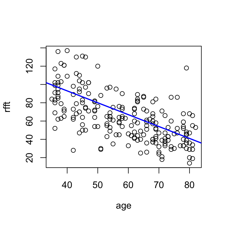
Consider what this line says about the relationship between RFFT and age:
With each year of age, RFFT score decreases by 1.3 points.
The intercept doesn’t have a clear interpretation, because \(x = 0\) is not meaningful for this dataset: technically, it says that RFFT for a 0-year-old would be 145, which of course is nonsensical.
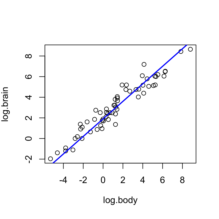
For the log brain weight and log body weight variables in the mammals dataset, experiment with the intercept a and the slope b until you find a pair of values that seem to reflect the trend well. Interpret the relationship described by the line.
I suggest starting with a = 0 and b = 0. Note that if the values are too extreme, the line may not appear at all on the plot.
Now we’ll develop some ideas that will help to assess how good these lines are as representations of the \(x-y\) relationship.
Residuals
A residual is something left over; in this context, the difference between the line and a data point. There is one residual for every data point. If we denote the value of the response variable on the line as:
\[ \hat{y}_i = a + bx \]
Then the residual for the \(i\)th observation is:
\[ e_i = y_i - \hat{y}_i \]
Residuals help to capture the fit of the model, because taken together, they convey how close the line is to each data point.
Visualizing residuals
Adding the argument res = T to the hand.fit(...) function will show the residuals visually as vertical red line segments.
# add residuals to the plot
hand.fit(x = age, y = rfft, a = 145, b = -1.3, res = T)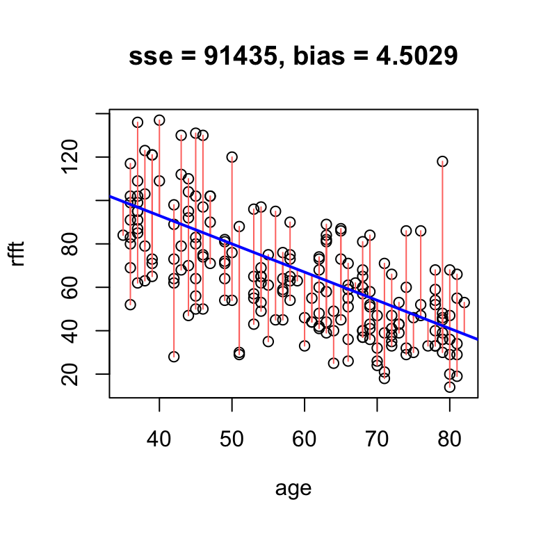
Data points below the line have negative residuals, and data points above the line have positive residuals.
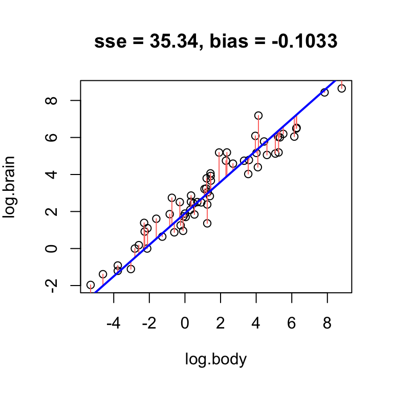
Plot the residuals for the line you identified in the last exercise.
Take a moment to consider what the residuals in your plot and the example above convey about line fit:
- What would the residuals look like if fit is good?
- What would they look like if fit is good?
Bias
In this context, bias refers to how often the line overestimates and underestimates data values:
- if the line tends to overestimate and underestimate equally often, it is unbiased
- if the line tends to overestimate more often or underestimate more often, then it is biased
The average residual captures whether the line is biased:
- positive average residual \(\longrightarrow\) underestimates more often \(\longrightarrow\) negative bias
- negative average residual \(\longrightarrow\) overestimates more often \(\longrightarrow\) positive bias
- average residual near zero \(\longrightarrow\) unbiased
So, define as a measure of bias the negative average residual: \[ \text{bias} = -\frac{1}{n}\sum_{i = 1}^n e_i \]
In the example above, the bias of 4.5 means that on average, the line overestimates RFFT score by 4.5 points. If we increase the intercept, we will overestimate even more often, and thus increase the bias:
# obvious positive bias
hand.fit(x = age, y = rfft, a = 165, b = -1.3, res = T)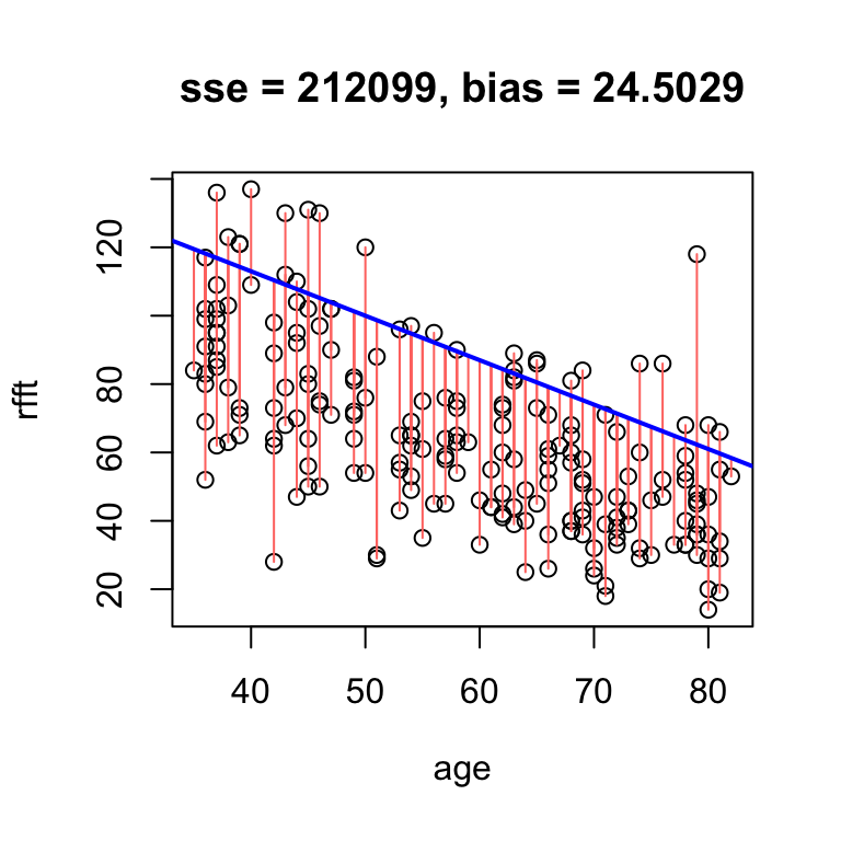
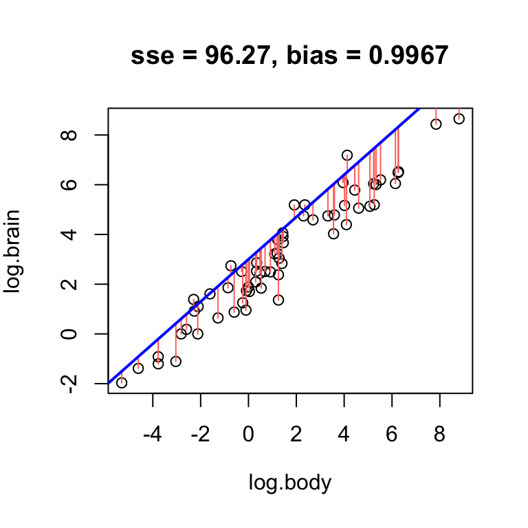
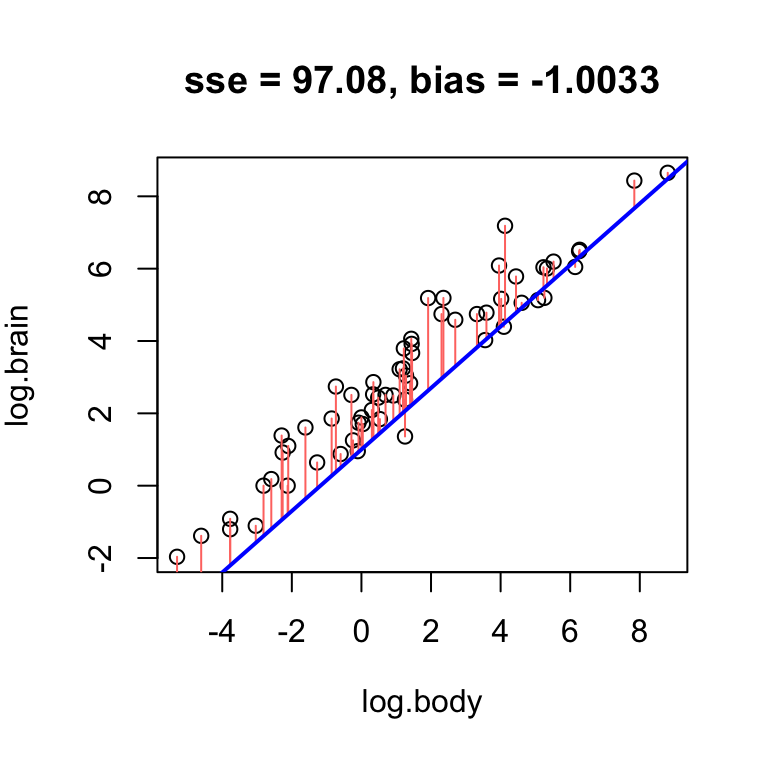
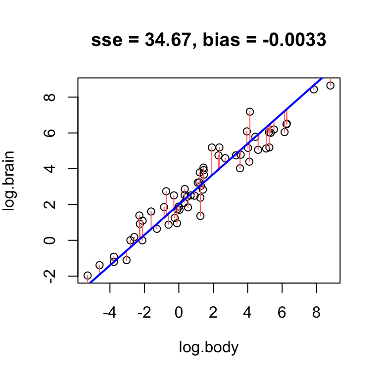
Using the log brain and log body weights in the mammals dataset, see if you can fit lines with positive, negative, and no bias.
- Find a line that has obvious positive bias.
- Find a line that has obvious negative bias.
- Find a line that has low bias.
For simplicity, keep your slope the same, and just change the intercept.
Clearly, low bias is a desirable property of a fitted line. However, it is not the only desirable property.
Error
The total magnitude of the residuals conveys how close the line is to the data scatter in general and thus, error. One way to measure this is by the sum of squared residuals:
\[ \text{SSE} = \sum_{i = 1}^n e_i^2 \]
This quantity will be smallest whenever the line is as close as it can be to as many data points as possible at once. As a result, a good fit will generally have low error.
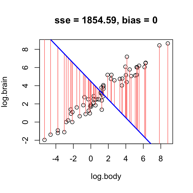
While high error can arise from bias, it is also possible for a line with no bias to have high error. For example, a horizontal line through the mean RFFT will have zero bias, but still be a bad estimate:
# no bias but high error
hand.fit(x = age, y = rfft, a = mean(rfft), b = 0, res = T)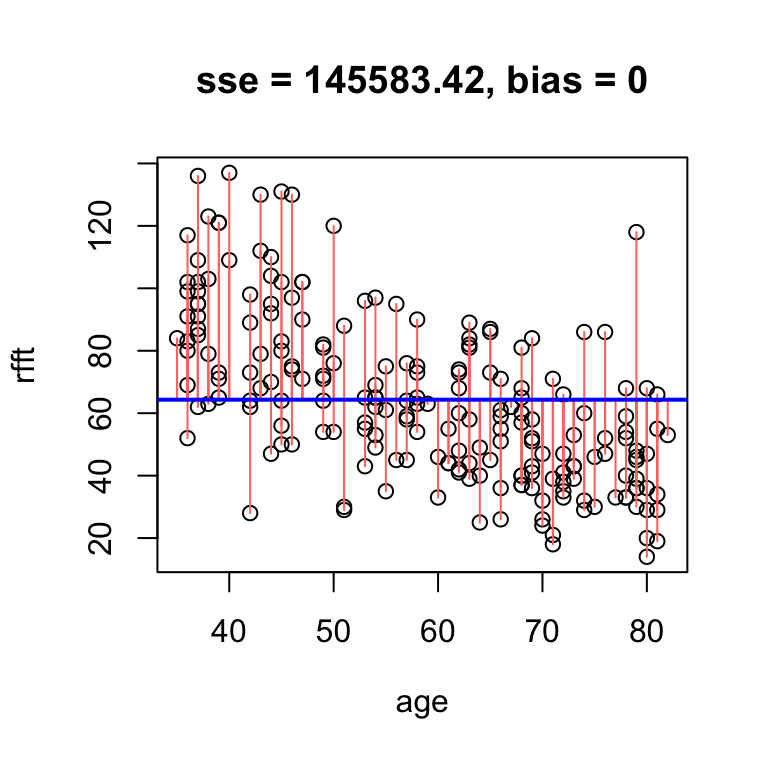
The reason the bias is zero is that the residuals balance each other out in the average. It is a mathematical fact that whenever the line passes exactly through the point defined by the sample mean of each variable – i.e., the point \((\bar{x}, \bar{y})\) – the bias is exactly zero.
Mimic the example above using the log brain and log body weights in the mammals dataset: find a line that has low bias but high error.
Best unbiased line
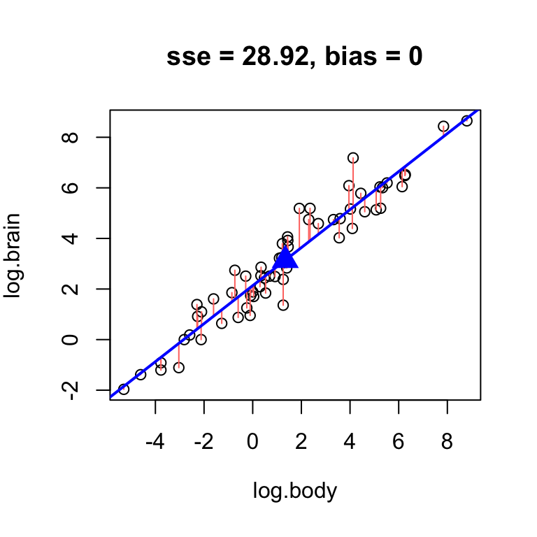
Considering that there is an easy way to ensure the bias of the line is zero – constrain it to pass through the center \((\bar{x}, \bar{y})\) – we should concern ourselves with finding the unbiased line with lowest error. Finding the best unbiased line reduces, essentially, to finding a slope.
Omitting the intercept altogether in the hand.fit(...) function will constrain it to pass through the center, add a point to visualize the center of the data, and print the intercept resulting from the constraint:
# omit intercept to force the line through the center point
hand.fit(x = age, y = rfft, b = -1.2, res = T)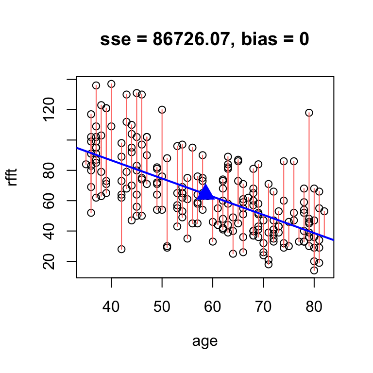
intercept     slope
 134.6375   -1.2000
Once we have a slope in hand, the intercept for the fitted line can be found by direct arithmetic:
# calculate intercept by direct arithmetic
mean(rfft) - (-1.2)*mean(age)
[1] 134.6375So, finding the best unbiased line amounts to fine-tuning the slope until SSE reaches a minimum. For the prevend data, the best unbiased line is about this:
# fine tune slope to minimize sse by hand
hand.fit(x = age, y = rfft, b = -1.19, res = T)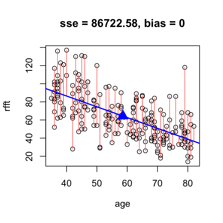
intercept     slope
 134.0515   -1.1900
So the best unbiased line results around \(a = 134.05\) and \(b = -1.19\).
There is an analytic solution for the slope of the best unbiased line:
\[ a = r\times \frac{s_y}{s_x} \]
# analytic solution
hand.fit(age, rfft, res = T,
         b = cor(rfft, age)*sd(rfft)/sd(age))
 intercept      slope
134.098052  -1.190794
The exact best unbiased line is therefore: \[ y = 134.0981 + -1.1908x \]
Find the best unbiased line for the mammals data.
Practice problem
[L10] The
kleiberdataset contains observations of log-transformed average mass (kg) and log-transformed metabolic rate (kJ/day). Kleiber’s law refers to the relationship by which metabolism depends on body mass.- Construct a scatterplot of the data, and be sure to orient the response variable and explanatory variable properly on the plot. Is there a trend, and if so, is it linear?
- Compute the correlation and comment on the strength and direction of linear relationship between log-mass and log-metabolism.
- Find the equation of the best unbiased line in slope-intercept form.
- [extra credit] Find an expression of the form \(y = a x^b\) for the relationship in (c) on the original (i.e., not log-transformed) scale. What is the exponent \(b\)?
